Showing posts with label Top quality web design agency. Show all posts

Tuesday, 21 July 2015

How to Choose the Right Host for Your Website

How to Choose the Right Host for Your Website


How to Choose the Right Host for Your Website

There are thousands of web hosting companies -- the services that essentially connect your site to the internet. So how does an entrepreneur choose the one that's right for his or her business?

To ensure that your hosting company supports your business needs and doesn't create unnecessary hurdles to your website's success, you first need to understand the major types of hosting. Then, consider some basic criteria to help choose the best plan for you.

Types of web hosting plans: 

 As you begin shopping for a web hosting plan, you'll encounter a number of different types, including the following options:

Individual plans. 

These are the most affordable options. As an example, HostGator's introductory package starts at just $3.96 a month for a three-year package. Typically, these plans provide hosting support for a single domain only and may limits the features, bandwidth and data storage. So, they are often best suited to beginning webmasters who don't anticipate significant traffic or special needs for their websites.


Dedicated servers. 

Individual plans are sometimes referred to as "shared hosting plans" because they share space on hosting servers with other webmasters. When webmasters outgrow the features made available through these limited plans, they will need to upgrade to ones that grant companies their own servers.

These plans will cost more, with Hostgator's offerings beginning at $139 a month, for instance. If you anticipate growing to a size that eventually requires this upgraded option, be sure to choose a hosting provider that offers both types of plans and allows for account transitions.

Reseller accounts. 

Reseller hosting occupies a special niche between individual plans and dedicated server arrangements, allowing clients to set up multiple individual plans within a single account. Reseller plans typically cost between $10 and $20 a month and are best suited for businesses that anticipate running several small websites.

What to look for in a hosting plan: 

Once you've decided on the type of hosting plan, consider these issues in choosing a specific provider:

Cost. 

While it's important to look for a hosting provider that offers reasonable rates, avoid free hosting programs entirely, as they may be unreliable and their low costs are often subsidized by required on-site advertisements.

Customer reviews. 

Customer reviews can be an excellent resource in evaluating web hosts because any fly-by-night host can put up a professional-looking sales page and make bold promises. Search for multiple reviews from current or past customers because a single positive review could have originated from the company's own marketing department.
If you'd like a shortcut here, pay close attention to HostGator, Bluehost and 1 and 1, which all tend to garner positive recommendations from clients.

Customer support. 

Whether you're a beginning webmaster or a more experienced digital business owner, you'll want a dependable customer support team behind your web hosting plan. Things can and will go wrong on your website's backend, but getting support when you need it can go a long way toward minimizing any potential damage to your business.

Look for companies that provide 24/7 phone support, email access and online chat. Before committing to a plan, test out each of these features to get a feel for how well your needs will be met.

Storage and bandwidth allowances. 

As more hosting plans begin offering unlimited disk space and bandwidth, this may not be a concern for your business. But it's still important to be aware of any limitations to ensure that your plan has enough space for your website to operate effectively.

Script support. 

One final consideration is the hosting company's built-in support for popular web scripts. Say, for example, you want to run WordPress on your website. Some hosts offer built-in script packages that make the installation of this popular blogging platform a breeze. Other hosts limit the number of MySQL databases that can be created, which you'll need to run WordPress and other programs.

How to 'Split Test' Your Website to Engage Online Customers Better


How to 'Split Test' Your Website to Engage Online Customers Better


How to 'Split Test' Your Website to Engage Online Customers Better
AJ Kumar


When it comes to designing your website, you have two choices: Select the site elements you believe look best, or you can use "split testing" to determine which design features are most engaging to your audience.

Essentially, split testing randomly serves up multiple versions of your website's pages to generate data about their effectiveness. The process allows you to quickly improve your website's overall conversion rates and isn't nearly as complicated as it may sound. Here's how to do it:

1. Isolate website page variables.

 
There are two types of split testing protocols: A/B split testing and multivariate testing. A/B split testing, which pits two page variations with a single differentiating element against each other, can be a better choice for beginning webmasters than the more complex multivariate procedure.

To get started with A/B split testing, you'll need to choose a single variable to test. A few possible options include:
  • The wording, color, font, font size or position of your page's header text
  • The specific colors used in your website's background or design elements
  • The location of or wording used in your website's email newsletter opt-in box
  • The position, color or design of your brand's social media buttons
  • The color, design or location of any "Buy Now" buttons on your website

The possibilities are endless so be sure to focus on elements that are likely to bring about the biggest changes in your website's performance. Tweaking the color of your links, for example, may not have as much impact as optimizing your on-site calls to action.


2. Build web page variations.

 
Once you've selected a specific variable to test, create the different pages that will be pitted against each other. Keep in mind that, for now, you'll want to limit your changes to a single variable to conclusively determine which elements result in better website performance.

If, as an example, you've chosen to test two different wordings for your site's headline text, you'll need to create a new page that will challenge your existing version. If your site runs in HTML, simply copy your original page, make the necessary changes to your headline text and then upload the new page to your website using a different file name (as in, "page-2.html").

Alternatively, if your website runs on WordPress or any other content management system, log in to your dashboard and create a new page using the same naming convention described above. Copy the text from your original page into your test page and then change the single test variable you're isolating with this A/B split test.

3. Install Google's Content Experiments program.

 
Once your test pages are ready to go, log into your Google Analytics account and find the instructions for installing Google's Content Experiments program onto your website.

This free program replaces the older Google Website Optimizer service, but still retains many of the same useful features. Although the Content Experiments program can let you test up to five pages against one another, most beginning webmasters will still find it easier to stick to a single test variable across two page variations. That can let you identify the specific elements that have the greatest impact on website performance as quickly as possible.

To set up a Content Experiments test, first select the pages to include in your split test. Then, specify to Google how much of your traffic should be exposed to the experiment, as well as the overall goal of your test. Most webmasters will want to set this value at 100 percent because doing so will help generate test data as quickly as possible. Finally, you'll be given a small snippet of code to install on your website, and your test will go live upon your approval.

4. Measure your results.

 
As your test proceeds, your results will be automatically updated within your Google Analytics account. However, there are a few things you'll want to keep in mind before making decisions based on this data.


First, it's important to wait to make any decisions about which page variation is the "winner" until Google Analytics is able to generate enough data to predict statistical significance. Judging the results of your A/B split test after only a few page visits simply won't give you enough information to draw solid conclusions about the best way to improve your website.
Once you do identify a winner, either move on to a new split test variable or create additional page variations to challenge your winning content. You want to maintain a mindset of continuous improvement for your website, so always be testing.

Are You a Bad Web Design Client?

Are You a Bad Web Design Client?  

Have you burned through multiple creative agencies trying to get an effective website? Are you still not happy with the website you have now? Perhaps the problem has been something you have more control over than you know. That problem could be you.
In this article we are going to help you, as a web design client, learn what makes a bad client and how to avoid these things to get an effective website from your design team.
Bad Web Design Client

What Makes a Bad Web Design Client?

We love and appreciate every single client we get the opportunity to work with. However, every once in awhile we do get that one client that makes us reconsider our relationship with them. If you’re a freelance designer or creative agency, then you most definitely have found yourself in these situations as well. If you’re a client, and you’ve burned through multiple web designers or still don’t have an effective website, then perhaps that bad web design client is you.

Let’s take a look at the characteristics of a bad web design client

  • You expect more design work than what you paid for
  • You think that every web design task should always be turned around in minutes
  • You put in last-minute requests that are always needed ASAP
  • You are extremely vague with design preferences or requested feedback
  • You ask to copy someone else’s web design exactly as is
  • You like to fax photos or copy that you want used in your web design
  • You ask your web designer for help with everything, but web design (eg. how to fix your fax machine)
  • You threaten your designer with taking your project overseas to someone cheaper
  • You go MIA for weeks or months without notice when design feedback is requested
  • You offer a payment that is far less than what you’ve been quoted
  • You try to teach web design best practices to your web designer
  • You completely switch design direction after approving design compositions
  • You treat your web designer like a low skill, replaceable employee


How to Be a Good Web Design Client…


Don’t get us wrong, more often than not bad web design clients don’t start that way. They become bad clients as a result of their web designer, or their original salesperson, not properly doing their jobs and communicating the right expectations upfront.
To help everyone, clients and designers alike, from avoiding these situations we have created the following checklist to produce positive web design projects
Before a project starts, clients should always…
  • Request to see the designer’s best work
  • Clearly understand, and agree to, all design costs and prices
  • Read and understand any and all terms and conditions
  • Provide at least 5-10 web designs that you like (make sure to list reasons why too)
  • Provide any and all logos, photos and content that you’d like to see in the designs
  • Schedule a block of time each day or week to work with your designer or project manager
It should be the responsibility of your designer, project manager and/or salesperson to clearly communicate and request all of these things, but it never hurts to be proactive. In doing so you will create a level of excitement with your design team that will encourage them to want to produce their best work for you.
TIP: Prepared, responsive clients lead to motivated, enthusiastic designers. Motivated, enthusiastic designers are more likely to include some design work for free.


…and Get a Great Website

At the end of the it’s on us, as an agency, to properly manage expectations and produce happy clients. So whether you think you’re a good or bad web design client, if you’re still relying on an ineffective, outdated website to grow your business then we want to help. Our team of designers, project mangers and consultants will make sure to help us both avoid anything but a positive, memorable experience.

The Psychology of Why Sexy Websites Suck at Sales

The Psychology of Why Sexy Websites Suck at Sales

Did you know we trust attractive people more than unattractive ones?
Illogical, but true.
We like people who are nice to look at—and we want to say yes to people we like. Not only that, but we actually think beautiful people are smarter, kinder, and more trustworthy.
Personally speaking, I was once suckered into paid membership with an organization I’m ideologically opposed to because the young woman selling subscriptions was, well….let’s just say I bought it. True story. On the other side of the coin, I was pretty suspicious of famed internet marketer Bob Bly when I first saw his photo.
But don’t take my word for it — Dr Robert Cialdini wrote all about it in Influence: The Psychology of Persuasion.
WEB DESIGNERS AUTOMATICALLY GRASP THIS PRINCIPLE AND APPLY IT TO THE WEBSITES THEY CREATE
And good for them. Recent research from Melbourne University vindicates their instinctive belief that attractive websites are more trustworthy—and thus more likely to convince prospects to buy. It shows that consumers are 20% more trusting of websites than they were five years ago—largely because websites today are prettier than the websites of 2006:
As aesthetically orientated humans, we’re psychologically hardwired to trust beautiful people, and the same goes for websites. Our offline behaviour and inclinations translate to our online existence … With websites becoming increasingly attractive and including more trimmings, this creates a greater feeling of trustworthiness and professionalism in online consumers.
All great news—we can rest easy knowing our desire for a flashy, sexy, all-singing and all-dancing website is actually going to increase sales as well as our egos. Right?
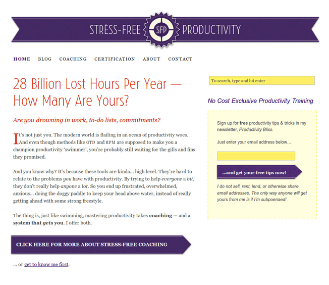
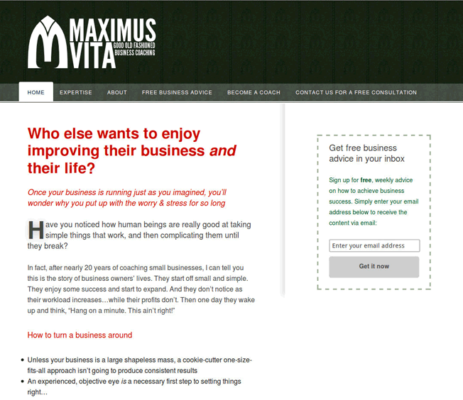
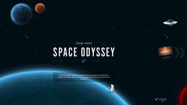
OKAY SMARTY-PANTS, THEN WHICH OF THESE WEBSITES IS MORE TRUSTWORTHY—?
asdf
asdf
asdf
asdf
If you’re like me, you probably feel World of Social and Space Odyssey have a lot more sex appeal than Stress-Free Productivity and Maximus Vita. It’s not that the latter sites are unattractive—just that the former are way sexier.
BZZZT
The problem is, as it turns out, that while our intuition about attractive websites being more trustworthy is dead on…our understanding of what “attractive” is—well, let’s just say it’s not all there.
In a video discussing the research I mentioned before, its author Dr Brent Coker explicitly explains…
By attractive we mean very well balanced, and following conventions such as logo top left, navigation across the top, search on the right, nice colors, nice quality design.
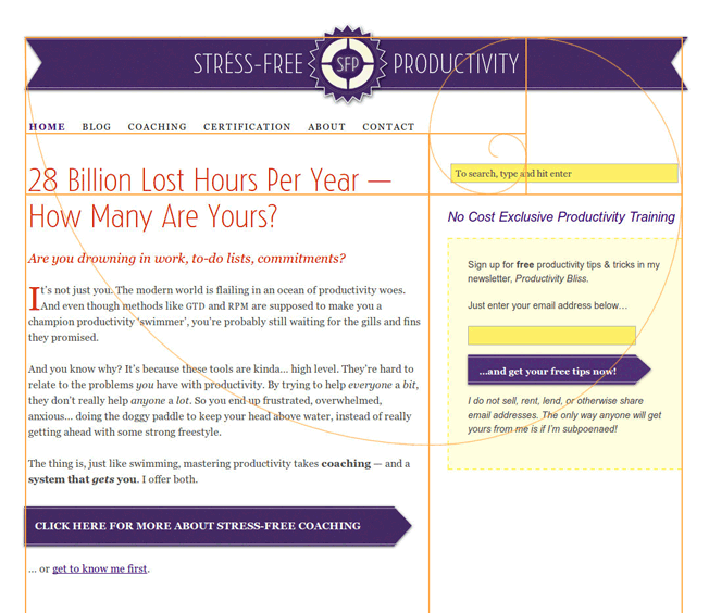
When I quizzed him further, Brent added that “well balanced” means most importantly that the site conforms to the Golden Ratio—as well as having a carefully-selected color palette:
Golden Spiral Website Design
This is a site I created. The spiral is known as a Fibonacci Spiral, and the boxes show the Golden Ratio, which is found in many things we consider particularly attractive. As you can see, fitting the elements of a site into the Golden Ratio does involve compromise—in this case there were technical limitations behind the scenes. Nonetheless, the general width and placement of the elements feels pleasing because of their conformance to the spiral.
In other words, what average users find attractive is not what we like to think of when we envision our new website. You know, the one that will wow our customers and win awards. Something that hasn’t been created before?
What’s important to the average web user is that the site is not original. At least, not too original. If it’s not similar enough to other websites, problems arise.
The Space Odyssey site above is a perfect example. It has no standard navigation—and little to no textual information is visible either.  To interact with the site, you must hit a button that is easily mistaken for part of the decorations.
World of Social has even less text; just a huge number of images that move when you mouse over them—but aren’t clickable.
Obviously the designers intended these problems to be features—so why are they “bugs”? Well, as web usability expert Jakob Nielsen put it, all the way back in 1996,
Don’t assume that users know as much about your site as you do. They always have difficulty finding information, so they need support in the form of a strong sense of structure and place. Start your design with a good understanding of the structure of the information space and communicate this structure explicitly to the user.
THINGS HAVEN’T CHANGED
In case you’re thinking that web users are more savvy today, or at least more willing to experiment and play with unusual designs, let me reassure you: they are not. Discussing his recent research, Coker says:
The biggest source of frustration for web surfers appears to be the ability to find relevant information on a website—that’s the biggest killer, the biggest driver of dissatisfaction. As soon as a web visitor is dissatisfied they will leave that website and defect to a competitor. And the best way that website owners can stop that or reduce that is by increasing the relevancy of information.
In other words, the major challenge for websites is helping users to find what they want straight away. As Coker says, “you need a very good map to help people get around”. And Nielsen has discovered the same thing in his own research:
Uncovering navigation shouldn’t be a major task: Make it permanently visible on the page. Small children like minesweeping (passing the mouse around the screen to see what’s hidden), but teenagers don’t like it, and adults hate it.
JUDGING AESTHETICS STARTS WITH WHAT WE KNOW
Web designers are in a very privileged position, aesthetically speaking. They have a highly developed sense for what is attractive and what is not. They’re aware of design trends, and can see immediately that one website looks dated, while another looks generic. They judge aesthetics on that basis—as in the examples of Maximus Vita and Stress-Free Productivity above.
And we tend to take our cues from them. Indeed, there are dozens of web design galleries online showcasing all kinds of sexy sites. And we take for granted that that’s what really good websites are like. We want something like that. Not something basic, unoriginal, even bland-looking.
But that is not how most people’s minds work.
To draw a somewhat geeky analogy, web designers are like Starfleet officers in Star Trek. They encounter a huge variety of alien species, and many of them have a very sophisticated sense of beauty. Jadzia Dax marries Worf, the Klingon.

Would you marry Worf?

To the average person, human faces are attractive, and Klingon faces are not. They’re too alien. And the exact same thing is true of websites. Sites without the logo and navigation at the top, search on the right, and elements fitting into Golden Rectangles are just too alien to judge. They also tend to be terrible at presenting the information users need.
To make your next web design successful, you need to tether your web designer firmly to the ground. Keep them in touch with reality. You must remember that the average web user doesn’t even know what a design gallery is—and is oblivious to anything except whether they can immediately find what they’re looking for.
If they can, then they have a foundation for judging the site’s aesthetics. Provided it falls basically into the Golden Ratio and meets some basic guidelines for color, they’ll almost certainly decide it’s a good-looking site. An attractive site. A site to be trusted.
If they can’t find what they’re looking for—if they don’t immediately see text explaining where they are and what they can do, and they can’t understand how to find that text—it doesn’t matter one iota how smoking hot the site looks to you, its proud owner.
Because they’re not even going to get as far as asking whether it’s pretty. They’re going to run to the back button just as fast as if a Klingon wanted to marry them.

About the Author: Bnonn is the author of a free course on 5 website changes you can make today to bring in more sales. Known in the boroughs as the Information Highwayman, he helps entrepreneurs sell more online by improving both their web copy and design. When he’s not knee-deep in the guts of someone’s homepage, he is teaching his kids about steampunk, Nathan Fillion, and how to grapple a zombie without getting bit.

Monday, 20 July 2015

7 Deadly Web Design Sins You Might Be Making


Web design is a tricky subject.
People have different opinions about what constitutes good web design and what doesn’t.
Some people think your site needs to be super sleek with an up-to-date, modern design in order to get attention. Others believe that web design doesn’t really matter all that much and you just need a site that works and lets people do what they want, like Craigslist.

Both answers are right depending on which industry or business you’re talking about. But, how do you figure out what’s right for you? And, how can you make sure you’re web designer knows what they’re talking about and won’t make mistakes?

This post presents seven deadly web design sins you don’t want to make on your site

The good news is that they’re all simple principles every website should follow. So, whether you get a slick design or not, you still need to know about these design principles and how they apply to your site.

Also, you can use these principles to make sure your web designer knows what they’re doing. Just because someone is a good designer doesn’t mean they know how to design for the web. And, just because someone designs websites doesn’t mean they know how to design a site that will convert. Pay close attention to the principles presented in this post, and use them if necessary to make sure your designer designs a site that’s optimized to get the results you need.

Mistake #1: Fonts That Are Too Small

The first mistake people make is creating a site with fonts that are too small.
The reason for this is that, back in the day, most websites had small fonts. The standard was somewhere around 12 px, and nearly everyone followed that standard.
But, over time, people started to realize that 12 px fonts are hard to read online. When a screen is 24 inches from someone’s face, small fonts make it difficult to read.
People also started to realize that you have only a limited amount of time to get visitors’ attention and let them know they’re in the right place. One study even states that the average attention span in 2013 was 8 seconds, one second less than the average attention span of a goldfish. The same study also states that people read only 28% of the words on an average web page.
1 goldfish shot

A 2013 study found the average attention span of people is 8 seconds, one second less than that of a goldfish. Is that even possible? Flickr: photographer23, Creative Commons license
In order to get people’s attention right away, you need to do the following:

  1. Compose great headlines that grab readers’ attention.
  2. Write interesting content that will get them to read more than 28% of what you’ve written
  3. Use headline fonts that are big enough to demand attention
  4. Make sure body fonts are large enough to read so readers don’t give up because they’re tired of squinting.
For all the reasons mentioned above, font sizes have increased over the last few years to the point that many view 14 px as the very minimum font size, and many sites go even bigger with 18 px as a minimum, especially when a lot of reading is involved.
Here are some examples of exceptional web design with great font sizes:
KISSmetrics

  • Headline: 35 px
  • Footer: 15 px
2 kissmetrics home page
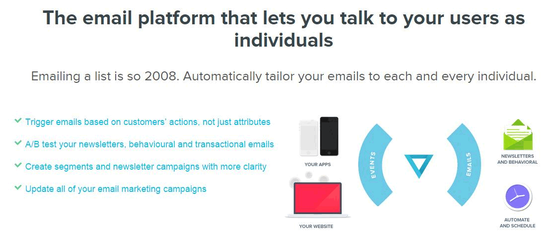
Vero

  • Headline: 41 px
  • Body: 18 px
3 email platform talk to users
Help Scout Blog

    Intro text: 26 px Body: 19 px
4 getting people to sign up
The point to keep in mind is that the purpose of writing copy is to get it read. When you pay a writer good money or painstakingly write website copy yourself, you want to make sure it gets read and doesn’t get hidden by a small font that makes the copy difficult to read.
You also need to remember that not all fonts are the same size. A 16 px Arial font can be smaller than a 16 px version of another font. This is something you need to be aware of when choosing a font size, so you don’t arbitrarily pick 19 px because another site did, only to find out your 19 px version isn’t as big.
Keep in mind that footer fonts can be on the smaller side and so can subtext, but if you’ve written something you want people to read, consider using a 16 px font at a minimum. And, in case you don’t want to take my word for it, Smashing Magazine preaches the same thing in this article: 16 Pixels for Body Copy. Anything Less Is a Costly Mistake.
Pro Tip: In order to get a feel for the size font you’d like to use, based on websites you like, download the WhatFont extension for Google Chrome. It’s a Chrome plugin that makes it really easy to click on fonts in order to find out what font type and size a website is using.

5 whatfont


Mistake #2: Moving Sliders

I still don’t understand why so many websites use moving sliders.
Are they effective? Do they convert? Are they the best way to present your information to customers?
In most cases, they are not.
Peep Laja wrote an article for ConversionXL titled Don’t Use Automatic Image Carousels or Sliders, Ignore the Fad. In the article he quotes Chris Goward of WiderFunnel and Tim Ash of SiteTuners as saying the following:

We have tested rotating offers many times and have found it to be a poor way of presenting home page content.
-Chris Goward
And…

Rotating banners are absolutely evil and should be removed immediately.
-Tim Ash
Laja also mentions two studies where rotating sliders were proven to be ineffective:
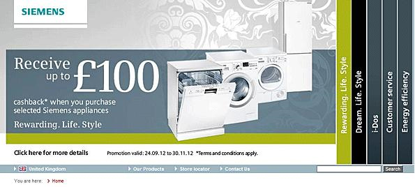
The first was by usability guru Jakob Nielsen. He asked a visitor if Siemens had any special offers for washing machines on their site. In fact, they did have an offer in 98-point font that said customers could get cash back on a new appliance. Unfortunately, the user didn’t see the offer because it was cloaked in a moving slider and ended up being completely missed.
6 siemens washer machine
This points to a theory among conversion experts that sliders cause banner blindness similar to ads in a sidebar. People are used to lame ads in a sidebar, so they have a tendency to ignore them. This principle seems to apply to rotating sliders as well.
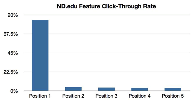
The second study was from the University of Notre Dame. They found that only around 1% of visitors clicked on the slider, with 84% of the clicks on the item in the first position.
7 edu click through rate
What’s the point of having a website slider if only 1% of people click on the item that is taking up your most valuable homepage real estate, especially when 84% of those clicks are on the first item anyway? Why annoy people with something moving that’s difficult to keep track of? Why not give them a single option to choose from since the majority click the first item anyway?

So, why do so many people use sliders since they appear to be so ineffective?
The best theory I can come up with is that it seems like a cool and high-tech feature, and it’s easy for web developers to implement. Based on those two factors, business owners say, “Hey, I want one of those fancy moving slider things,” and web designers comply because they look “cool” and aren’t that hard to do.

But website owners need to consider whether they’ll be effective and whether they’re the best way to convey information on their site, something Peep Laja, Chris Goward, Tim Ash, and many other smart internet marketing folks no longer believe is the case.
To solve this problem, start by asking yourself what is the best way to present your information instead of picking a site you like and copying their design, including the cool-looking slider they use on the homepage.

I used this approach with a friend of mine a few years ago for a website he was building for his tutoring company – Genesis Tutoring.
He and his business partner approached me and said, “Hey we want to build a website…and we want to have a slider on the homepage that has this information,” and then he showed me a flyer they hand out at schools to advertise their service. The flyer was beautiful, presented the information incredibly well, and, surprise, surprise, didn’t include a slider (those pesky sliders just don’t seem to translate well into the world of printed flyers).
So, I suggested, “Why don’t you just duplicate your brochure that’s already working on your homepage and then put a contact button along with your phone number and email underneath.” We tried that, and here’s how it turned out…
8 where learning begins
The site ended up looking great, avoided the dreaded default slider, and converts well. What’s not to like?
When it comes to building your own site, follow these instructions to get the same results:

  1. Remember not to blindly add a slider just because everyone else is doing it (even if your designer recommends one).
  2. Consider what is the best way to present your information on your homepage instead of just blindly copying what your competitors are doing.
  3. Choose a single important offer to list in the A-Space on your homepage and go with that. There will always be other things you want to promote, but you can do that farther down on the page or with a button at the top of the page. Pick one offer, make it prominent, and then get out of the way and let your website go to work.
  4. And to really hammer down the last point: think about the #1 goal you want your website to do. Focus on that and can all the other calls-to-actions.
Again, in case you don’t want to take my word on this, here are some articles you can read that support this point:


Mistake #3: Low Contrast Fonts

Another huge mistake people make is using low contrast fonts.
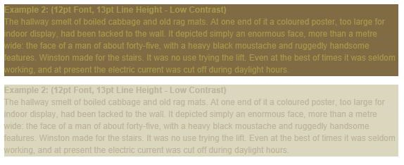
Low contrast means a lighter font on a light background or a darker font on a dark background. I’m not sure if this is something that looks ok in print design, but it’s never a good idea on the web.
You always want to make sure your website content is as easy to read as possible. The Smashing Magazine article referenced above told us that the amount of light that gets through our eyes at age 40 is only half the amount of light that gets through our eyes at age 20. This drops to 20% by age 60. On top of that, nearly 9% of Americans are visually impaired.
With these stats in mind, do you really want to make it harder for visitors to read your content, especially after you’ve paid so much and worked so hard to get them to your site in the first place?
9 bad text example

Low contrast for fonts is always a bad idea.
You can solve this by always using high contrast fonts. If the background is dark, the font should be light, and if the background is light, the font should be dark.
Actually, I’ll take this even one step further. Rarely are there times when you need to use any font colors besides black or white. Sometimes designers choose a lighter gray font on a white background or a light blue font on a dark blue background.
Why? Is that really easier to read, or are you just trying to add “visual appeal”? Books use black fonts on a white background for a reason – it’s easy to read. Websites would do well to follow this example.
Here are some samples of great font contrast:
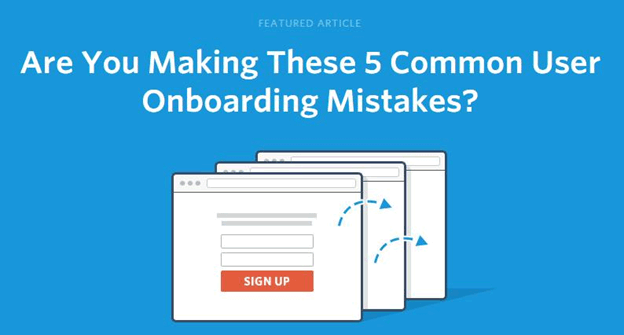
Help Scout Blog
10 onboarding mistakes
Evernote
11 evernote home page

This is an example of good contrast on an image, which is not easy to do.
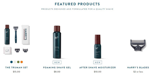
Harry’s
12 harrys feature products
The lesson to remember is that fonts should always have a high contrast with the background behind them. If you find the text difficult to read and feel like there should be more contrast, don’t hesitate to call your designer and let them know. Your website isn’t a design showcase. It’s a place to make sales and increase conversions.
Bonus Tip: Not only is high contrast important, but you also want to use reverse type sparingly. (Reverse type is white text on a black (or color) background instead of black text on a white background.)
In fact, David Ogilvy, one of the greatest ad men of all time, said ads should never be set in reverse type. Colin Wheildon, editor of the largest Australian motoring publication, set out to test this theory. His findings were astounding.
According to the study, below is a list of the comprehension level for different colors and backgrounds:

  • Black text on white: 70% good, 19% fair, 11% poor
  • White text on black: 0% good, 12% fair, 88% poor
  • White text on purple: 2% good, 16% fair, 82% poor
  • White text on royal blue: 0% good, 4% fair, 96% poor
Isn’t that incredible? The results from black text on a white background compared with white text on a color background are nearly the exact opposite!
The takeaways are:

  • Always remember to use high contrast fonts, but also…
  • Use reverse type sparingly.
Sometimes reverse type looks good, but it can have a drastic impact on readability and retention. As such, you should use it only for parts of your site that don’t require as much reading and aren’t as important. Overall, you’d be smart to think twice before using reverse type.
13 hubspot grow

This reverse type looks “cool” on HubSpot’s homepage, but it may not be the best for readability and comprehension, especially in the most important space on the entire site.

Mistake #4: Poor Line Height for Text

Line height for text is something that often gets overlooked. A lot of web designers and developers choose a font, pick a size, arbitrarily select a line height, and then call it a day.
But line height has a surprisingly significant impact on a site’s overall design and appeal. Choosing the wrong line height can leave fonts looking crowded. It can ruin your entire design.
The good news is that talented web designers have a good eye for this and will automatically select a good height for you. The bad news is that the average web developer doesn’t have an eye for this design and will often pick the wrong line height.
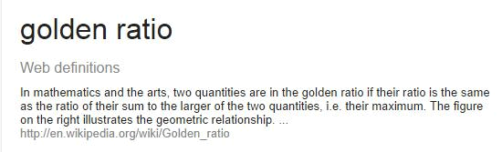
Chris Pearson of DIYThemes felt so strongly about this that he built a line height calculator configured to something known as the golden ratio. Here’s Google’s definition of the golden ratio:
14 golden ratio
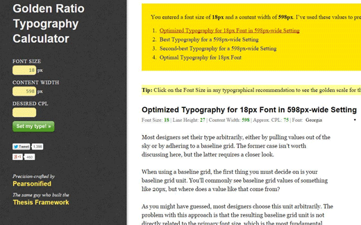
A more simple definition is that the golden ratio is a proportion that’s believed to be aesthetically pleasing. Without boring you with more detail, Chris Pearson used this ratio to build a calculator that combines font size and content width to come up with the ideal line height. The good news is that the calculator makes this super easy to do. You simply plug in your font size and content width, and the calculator will tell you what your line height should be.
15 golden ratio typography calculator
You may not have realized it, but there’s a reason some designs and font combinations are more pleasing than others. Great designers know how to achieve the golden ratio on their own, but Chris Pearson’s calculator makes it easy for everyone else to do the same.

Mistake #5: Line Length That’s Too Long

Another mistake you can make is creating lines of text that are too long.
So, what’s the optimum line length?
The Baymard Institute published an article that says 50 to 60 characters per line is best, with up to 75 characters being acceptable.
The reason line length is so important is because long lines of text are intimidating to read online. If the line length is too long, some people will not begin reading because it doesn’t look like a very good reading experience.
On the other hand, if line length is too short, readers have to start and stop lines frequently, which becomes annoying.
This problem is compounded by the popularity of responsive design. If you don’t set a maximum width for content section, you have no way of knowing how long the line length will be for your blog or any other piece of text since screen sizes vary so much.
At the time the referenced article was written, The Baymard Institute dealt with this problem by setting a maximum width for their text of 516 pixels which leaves an average of 65 characters per line at a font size of 18 px. This creates a great reading experience, as you can see in the image below.
16 readability
Once again, this is a design detail that not all designers are going to pay attention to, but now that you know long lines of text are intimidating to read, you can direct your designer and developer to make sure you deliver an optimal experience for readers.

Mistake #6: No Accent Color for Calls to Action

The next web design sin is not using an accent color. Here’s what I mean:
Smart internet marketers know that you need a good accent color to draw attention to key calls to action. If you’re asking someone to “Buy Now” or “Start a Free Trial,” you want to make sure you use a button color that will draw people’s attention so they’ll click and take the action you want them to take.
This seems simple enough, but I’ve seen multiple occasions where designers didn’t reserve an accent color for the most important calls to action. Instead, they chose a color that’s already used on the site for something else. That’s not a good idea.
Here are some rules of thumb to follow for accent colors:

  1. It needs to be bright enough to draw attention to whatever you’re attempting to draw attention to.
  2. It needs to be complementary with the other colors on your website so that it doesn’t clash.
  3. It needs to stand out from whatever background it’s on. This means that a blue button on a blue background probably isn’t a good idea.
  4. It needs to be reserved for key calls to action so it doesn’t blend in by getting overused on the site.
In the example below, you’ll notice that the CTA button is bright orange. This helps it stand out from the white background. Also, orange is not used anywhere else in the design (except for a splash in the logo which is small enough that it doesn’t compete for attention). You can check out the full page here if you’d like.
17 ispy

Mistake #7: Common Design Principle Violations

The final deadly mistake is not following common design principles, which is something that Steve Krug talks about in his book Don’t Make Me Think.
The point he makes is that website visitors are used to being able to find certain features in certain places. For example, they’re used to finding logos and taglines in the top left of a page, and menus in the top right. They’re also used to being able to find an About page and a Contact page if they want to learn more about the organization or get in touch.
This means it’s a good idea to include those features on your site and that you should think twice before breaking common design principles. This may be something you think is obvious, but it’s not always.
Some website owners, for example, decide to be super creative and come up with a different way to display the menu. Instead of being at the top where it’s normally found, it’s included in the branches of a tree that’s built into the background design (or some other creative way to include a menu other than the standard way).
Sometimes these crazy new approaches work, but often they don’t. In most cases, it is much better to follow common design principles (so you don’t confuse visitors) than it is to come up with a crazy new layout that may be creative but not intuitive.

Conclusion

Hopefully, you’ve learned a lot by reading about these seven deadly web design sins. Most of them seem to be common sense, but they all get broken more frequently than you would think.
Remember, if you’re going to do any design changes at all, make sure you test your changes to see how they affect your bottom line!

Now that you’re aware of these principles, pay attention to the websites you come across and see how many follow these rules. I’m confident you’ll start to realize how important these rules are, which will reinforce why they are important to follow.
Over to you: Did I miss any deadly web design sins you frequently see committed online? Leave a comment to add to this list.

About the Author: Joe Putnam (@josephputnam) is a Growth Manager for iSpionage, a PPC competitive intelligence tool that makes it easier for smart advertisers (and agencies) to set up profitable campaigns faster.

Saturday, 18 July 2015

A review of Color Theory for Website designers

 These details is part of our Basix series, on practical and concise design concepts for people who've little design experience ... let us to begin!
James Web Design Malaysia
Add caption


About This post is written for:

This post is for individuals who're simply beginning to uncover the written formal design concepts. There is no intention to do an extensive study of techniques the color placed on a design (we have lots of people who afterwards), but it's a look at everything practical advice to be able to color theory under to approach an internet site design project.

I write since i have always think it is hard to choose one palette that really work for just about any project it's probably one of the most difficult options I have to do just like a designer. However, comprehending the basic principles of color theory along with a couple of great tools to boost available on the web, I am able, my sketches and because of this weakness.

Some candidates for your target group:

    A programmer to help people seeking advice, create a visually appealing prototypes.

    An ambitious designer who would like a brief review of the topic

    Somebody who does not know the among web site design and website design.

The bottom line is: What's color theory?

Chromatics really covers to produce, however in the least expensive level, it is the interplay of colors in the design for the complementation, contrast and dynamics.

    The interplay of colors in the design for the complementation, contrast and dynamics.

Throughout part among the definition is easy (not to mention bland), fundamental necessities last three words define the essential color theory:

Complementation

Complementation means approach we decide to try see colors if this involves their relations while using other colors. If colors occupy opposite finishes in the color spectrum, they've created a visually appealing design, having a balance are will be in the interest. Rather than forcing a specific portion of ??the color spectrum Host might be the attention an equilibrium. You'll find two common reasons of supplements: the triadic color plan and composed, after we discuss later. Complementation You'll be able to take new design amounts of elegance when you begin to know the subtleties of color combinations.

Contrast

Contrast reduces eyestrain and directs anyone's attention through apparent separation elements around the page. Most likely probably the most apparent instance of the contrast is an excellent choice of background text color as proven below:

Color theory for web-site designers

Color theory for web-site designers

Color theory for web-site designers

Color theory for web-site designers

A lot more doubt, the most effective practice generally is a very light color for your background, also to choose a really dark hue of the writing itself. It becomes an area where color theory is ideal for the customer-friendliness of a web site design In lots of projects, large text areas will not be considered a place to get really creative - so keep it simplistic and readable things.

While using establishment of readable text, the contrast might also win the viewer's concentrate on specific items around the page. Think Mark a guide: If you want to attract your concentrate on a specific part of the page, increase the risk for atmosphere totally different from the comfort in the text to appear. The identical principle is relevant for Web Site Design: Using numerous contrasting colors may help attract the viewer's concentrate on certain facets of the page.

Just in case your website features a dark background, focus on the substance getting a lighter color.

Color theory for web-site designers

Color theory for web-site designers

This principle is also relevant to similar colors (spoken about later):

Color theory for web-site designers

Dynamics

Not to appear silly, nevertheless the dynamics of feelings dictate your construction. Better colors move the user feel more energetic after your design that's especially effective if you are trying to advertise a product or provide a mental response. Deeper shades relax the customer, to make sure that her mind to give consideration with other activities. A good example can be a comparison between CNN and Ars Technica:

Color theory for web-site designers

The CNN website features a distinctive red-colored-colored banner towards the top, which leads to elevated feelings of clients, because it in the dynamism in the design (as well as the contrast involving the colors red-colored-colored, white-colored and black primary color encourages website).

Color theory for web-site designers

Ars Technica used a far more dark color plan for your background your brain to wind down the customer also to focus their attention by themselves contents. It'll consider the technical and detailed writing since the vanguard in the site. And more importantly, it allows the customer to mental energy typically reserved together for vibrant colors, to have the ability to know the content want to know ,, to get sent.

How to locate a color plan effectively?

Listed below are three generally recognized structures for just about any good color plan: triad, composed, and so forth:

Triadic Color Plan

Color theory for web-site designers

Compound 3 colors on separate finishes in the color spectrum. It's an excellent way to make a triadic color plan:

    Possess a color wheel, and choose your color.

    Draw an equilateral triangular came from here.

    The Three corners in the triangular form a 3-color system.

Utilizing an equilateral triangular, you're able to be certain the colors the identical dynamics and complement each other correctly.

ColorScheme connection (also called Free Split)

Color theory for web-site designers

The color palette is, is founded on delivering a number of complementary colors: two colors are selected from opposite finishes in the color spectrum. In using this method, the designer is allowed more freedom inside their design while enjoying useful advantages of the feel of complementary colors.

Similar

Color theory for web-site designers

An similar color plan is founded on a careful selection of colors inside the same portion of ??the color spectrum relies. The colors distinguished by their shake in addition to their contrast while using other be.

Two good good examples from the pattern of comparable colors are:

    Yellow and Orange Shades

    A range monochrome (shades of color)

Just the beginning ...

The positive thing about where we are ever, is becoming that individuals make use of the centuries of scientific and art theorist colors. You'll find whole volumes are actually written round the systems of color theory, and so i am prone to encourage you need to search hard within you inside the matter, among the numerous academic books open to utilize a couple of from the concepts are deep. We'll also publish the finest   articles about "color theory for web-site designers" afterwards here Webdesign Tuts :).

Now let's look good quality tools will experiment on your own:

Techniques to make your existence simpler

Fortunately, you'll find some tools available, particularly easy to really make the choice of colors, if used properly. And in addition, you'll deepen our understanding of color theory.

By experimentation in the brought atmosphere, we could learn how to apply these concepts, without, if things fail perfectly frustrated. Set these tools certainly explore like a kind of "color theory, the rear-up" your individual creativity without ever losing your way too definately not set rules for blends of enjoyable colors.

Kuler

Color theory for web-site designers

Created by Adobe tool, Kuler is built to an intuitive way to make a color plan ought to be created. Each color inside the palette might be changed, or since the base color selected getting a few simple clicks. The pallets might be registered and launched, and you'll find numerous great community input online. Under each color export features are provided (including hexadecimal). However, the interface might be awkward sometimes, modifying towards the dynamics from the particular color, the entire palette (If perhaps they'd a "Lock" function, another colors saved to move) to change. Overall, I would recommend it for people who work a great understanding of concepts and persistence, when situations are not only like they need.

Color Plan Designer 3 (Paletton)

Color theory for web-site designers

It quickly increased to get the most popular choice for beginners that are around the deadline with persistence, or people. By delivering a simple and controlled choice Color Plan Designer supplies a suprisingly low barrier to entry, which is choice of color concepts provides several options. Even though it shows its clients precisely why the shades interact well (dynamic Kuler color wheel is much more good at by doing this), the final results are excellent just like a beginning point or conclusion from the prototype.

Its advanced options are extremely useful: features such as the chance to regulate the saturation and contrast from the area, colorblind overlays and sample location extracts are items that I am hoping Kuler items soon. I'm however, this tool should not function as the primary tool of people who uncover the idea color as she does a lot of use the customer and does not let them experience intuitive and concurrently wish to use bases of each and every principle color.

Yes, if you have been, many other places and you will uncover great designs and colors ... we'll publish people pages really come up with and evaluate them soon (search the web site for assets when corncobs He goes).

Example: Players with Jobs

To complete this informative article, we'll examine a web site having a couple of from the concepts we've spoken about. Players with Jobs can be a site that promote round the analysis of game game titles by their characteristics, podcast, together with an online forum.

Color theory for web-site designers

    The gray affiliate with white-colored background content focuses anyone's attention online in the center.

    The black bars silently (usually limited to advertising) "context" in the user inside the content view.

    Using orange-red-colored-colored inside the headers records user groups, the title in the function and check in the site.

    The neutral color plan offers enough visual stimulation to keep everybody, while experiencing them sufficient freedom of thought, the data in the website.

Advertising

Conclusion and Summary

Most likely the most challenging areas of coping with color is always that sometimes, when the colors aren't arranged in the design, they do not seem to be effective together. However, when they are applied, usually visual consistency is obvious. I have triggered enough frustration with the selected colors in Kuler prior to deciding to arrange it to discover the colour plan remains changed sufficient uncomfortable.

Confidence inside the theory! Accept in principle then adjust the selected colors in the color when needed. This can save you lots of time while increasing your design capabilities that you just start to, artistic, scientific and to start to see the colour of the greatest quality kind!

Summary

    A choice of colors round the opposite finishes in the spectrum creates a visible harmony in the eyes.

    A stark contrast involving the elements helps it be readable text, and draws attention from the site visitors.

    The greater the color, the higher mental energy they consume.

    Don't be afraid to tools for instance Kuler and Color Plan Designer 3 to take advantage of, they've created existence simpler and prevent you from getting frustrated while using learning process.

Appreciate reading through through my first article, I desired to create a thrilling time. Please provide feedback inside the comments if you feel look foward to so, If only to create these products as helpful as you can.

Oh! So when you've got an interest to discover more, see another large item in line with the concept that that which you just discussed refers: "visual hierarchy agreement in Web Site DesignInch.