Showing posts with label web design Malaysia. Show all posts

Wednesday, 5 August 2015

The psychology of Web design: How colors, typefaces and spacing affect your mood

The psychology of Web design

A great website design is so much more than just delivering content and making it look good. When visitors come to your site, they produce a set of feelings about your website and your organization. The type of feelings they produce – positive or negative – are entirely in your hands and should not be overlooked when designing content.

Over the years, there has been a body of knowledge produced to help designers create effective visuals that play into the psychology of their viewers. In order to achieve this, one must understand how different design elements and how we use them affect the mood, attitude and experience the visitor will have while browsing our website.

Below are four major areas of website design and development that have the biggest impacts on the psychology of website visitors. These are the tools you’ll need to create a visually-engaging site that encourages visitors to return.

Content

For websites, content drives the design you see on screen. Visitors come to a website to access information they need. Design helps them find the information they need quickly and with ease.
In the early days of the Web, it was common to see pages and pages slammed with content, often pages with 10,000 words or more (as a comparison, this article is about 1,600 words). With pages loaded down with content, it made it extremely difficult to find content, let alone read through to get the information needed. This often invoked stress, anxiety and overall unpleasant feelings for visitors.
With today’s Web, content should be edited and organized so that there is a happy medium between providing adequate and needed information while not overwhelming visitors. When content is in that happy place, visitors are able to find the information quickly and they feel good afterwards.
Hiding content, presenting too much content or otherwise mudding up your website makes visitors irritable, leading to possible loss in potential business.

In addition, the type of content you present sets a tone for you and your organization. If your content doesn’t present the right information in a logical place, is hard to follow or tends to beat around the bush on important information, then visitors will feel this way about you.
work desk computer laptophttp://www.webdesignbysper.com/

Keep your content clean, organized, easy to read, concise, and professional to help aid in the psychology of your visitors and produce positive vibes.
To help you craft the best content for your website, this article at Tuts+ goes into further detail on the psychology of great content for your website.

Space

The way a Web page is organized can dramatically affect how a visitor feels while they are there. Organizing content should be a priority in any website design, but this organization should take into consideration the space it takes up on the site.
If you’re not familiar, “white space” is the areas of a design in which no content or visual element demanding our attention is present. White space plays an important role in any type of design work, especially Web design, because it visually gives a resting place for the visitor. These resting places are often found in margins and the space around things.

whitespace design web
The concept of minimalism – that is, using the least amount of visual content needed to convey your point or idea – is currently very popular across the Web, specifically on services like Squarespace.
Said differently, if a visitor comes to your website and every inch of real estate on the screen is taken up by words, graphics, blinking things, etc., it starts to feel chaotic and makes them uneasy. If no white space is present, there is nothing for them to move their eyes to take a visual break.
If you take the time to edit and organize your content in a way that is respectful of the space you have to present the information, you give a feeling of professionalism, organization and overall good vibes to visitors. You want your visitors to feel like you have your stuff together and that you are easy to work with.
Keeping things simple with a well organized website using adequate white space tells visitors you know what’s important and you don’t want to waste their time.
Learn more about white space and keeping things simple in this Smashing Magazine article.

Color

chalk colors
When designing a website, often the colors are dictated by the organization’s new or existing visual identity (or brand). But how these colors are used affects how the visitor feels when they visit your site.
Most visual identities have neutral colors (i.e the tints, shades, and hues of whites, grays, and blacks) that are used along with their main colors. In most modern designs, these neutral colors often take dominance in terms of how much real estate they take up.
For instance, if an organization’s main colors are blue and yellow, with neutrals being white and black, it is likely that they may choose a white background to display their content on, instead of a blue or yellow background.
These neutrals act much like white space does: it provides an opportunity for rest. Using the example above, if all you see on that organization’s website was blue and yellow, it would be an overwhelming site to focus your attention on (think yellow text on a blue background).

The types of colors you use also play into the psychology of your Web design. Cooler colors (blues, greens, purples) often provide an inviting, professional and relaxed feeling. In contrast, it can be used to give a very cold and unfriendly feeling as well. Warmer colors (yellows, oranges, reds) are soothing, warm, and give a sense of creativity but can also give off negative feelings such as anger and stress.
example color design
In addition, neutrals such as white often give a positive feeling of openness, but could also feel bland and dull. Grays are often considered slick, modern, and clean, but can be very cold and uninviting. Blacks are often associated with being professional and clean cut, but is also very overpowering and can be rather generic.
How you use colors to help convey the positive feelings discussed above depends on the tint (lightness), hue (type) and shade (darkness) of the color as well as how much of the color you opt to use. If you want your site to be inviting, open and creative, a combination of blues and greens, with touches of yellow or orange, on a white or light gray background will help convey these positive feelings to your visitors.
For more information on how exact colors play into the psychology of web design Malaysia, Vandelay Design has a great article outlining each primary and secondary color and its effects on viewers.

Typography
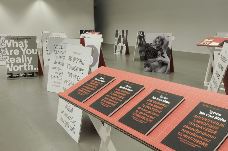
type we can make
Finally, typography can convey tons of emotions and feelings for visitors to your website. There are thousands of typefaces out there, and thanks to advancing Web technology such as CSS3, these typefaces have found their way onto websites as well.
No more picking a typeface out of the 15 or so Web-safe fonts. This has opened the door to thousands of new typefaces that can be used. And with great choice comes great responsibility.
Typefaces are designed to be used in specific situations and for certain uses. Serif fonts (those with little serifs, or feet, on the letters like Times New Roman) are often associated with professionalism, scholarly, and seriousness, while san-serif fonts (like Helvetica) are a bit more modern feeling, clean and more informal.
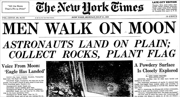
nytimes font front page
For example, most news websites (i.e. The New York Times) use serif fonts to help convey the feeling of tradition, importance and knowledge. They want you to feel like they are an authority, that what you are reading is important and that they know what they are talking about.
Sans-serif fonts are used more and more to convey a feeling of modern, clean, sophistication and upscale. Those in the technology industry often use san-serif fonts much more than serif fonts because they want visitors to feel like they are up-to-date and futuristic.
For more on what kind of fonts to use for your website design, Super Dev Resources has two great infographics to help you navigate your typography.
The way type is presented on the page is also important. Leading (space between the lines) and kerning (space between the letters) should be evaluated as well. Large leading with lots of white space between lines makes the copy feel airier and easier to read; little leading gives a crowded feeling and is hard to read more than one paragraph at a time.
via Fonts.comhttp://www.webdesignbysper.com/
via Fonts.com
Space between paragraphs, margins between blocks of text and other elements on the page, and font size (and its relation to leading) are also factors to consider. Tight paragraphs are uninviting and hard to read, copy that is too close to elements such as pictures make the page feel crowded, and too large or too small font size will either make the visitor feel like you are screaming at them or whispering.
Need ideas on the types of fonts available for your Web design? Check out offerings by Abobe’s TypeKit or Google Fonts for ideas on the possibilities.

Conclusion

It is often the designers’ job to understand the psychology of their design choices when producing a design, but understand the basics in some key areas of design will help you understand and even further help produce great content and manage your website design more effectively.
While these areas focus mainly on website design, a lot of the psychology of design can be used in other areas of design as well, such as logo and print design.
How will you apply these theories to your website?
Don’t miss: The importance of taking back control of your online identity and Designers’ dream giveaway: Win a Sony Alpha a5100, $300 in MOO supplies or a FiftyThree stylus

Interested in Squarespace? Use code THENEXTWEB for 10 percent off.
Image credits: Shutterstock, Unsplash, Squarespace

Tuesday, 21 July 2015

How to Choose the Right Host for Your Website

How to Choose the Right Host for Your Website


How to Choose the Right Host for Your Website

There are thousands of web hosting companies -- the services that essentially connect your site to the internet. So how does an entrepreneur choose the one that's right for his or her business?

To ensure that your hosting company supports your business needs and doesn't create unnecessary hurdles to your website's success, you first need to understand the major types of hosting. Then, consider some basic criteria to help choose the best plan for you.

Types of web hosting plans: 

 As you begin shopping for a web hosting plan, you'll encounter a number of different types, including the following options:

Individual plans. 

These are the most affordable options. As an example, HostGator's introductory package starts at just $3.96 a month for a three-year package. Typically, these plans provide hosting support for a single domain only and may limits the features, bandwidth and data storage. So, they are often best suited to beginning webmasters who don't anticipate significant traffic or special needs for their websites.


Dedicated servers. 

Individual plans are sometimes referred to as "shared hosting plans" because they share space on hosting servers with other webmasters. When webmasters outgrow the features made available through these limited plans, they will need to upgrade to ones that grant companies their own servers.

These plans will cost more, with Hostgator's offerings beginning at $139 a month, for instance. If you anticipate growing to a size that eventually requires this upgraded option, be sure to choose a hosting provider that offers both types of plans and allows for account transitions.

Reseller accounts. 

Reseller hosting occupies a special niche between individual plans and dedicated server arrangements, allowing clients to set up multiple individual plans within a single account. Reseller plans typically cost between $10 and $20 a month and are best suited for businesses that anticipate running several small websites.

What to look for in a hosting plan: 

Once you've decided on the type of hosting plan, consider these issues in choosing a specific provider:

Cost. 

While it's important to look for a hosting provider that offers reasonable rates, avoid free hosting programs entirely, as they may be unreliable and their low costs are often subsidized by required on-site advertisements.

Customer reviews. 

Customer reviews can be an excellent resource in evaluating web hosts because any fly-by-night host can put up a professional-looking sales page and make bold promises. Search for multiple reviews from current or past customers because a single positive review could have originated from the company's own marketing department.
If you'd like a shortcut here, pay close attention to HostGator, Bluehost and 1 and 1, which all tend to garner positive recommendations from clients.

Customer support. 

Whether you're a beginning webmaster or a more experienced digital business owner, you'll want a dependable customer support team behind your web hosting plan. Things can and will go wrong on your website's backend, but getting support when you need it can go a long way toward minimizing any potential damage to your business.

Look for companies that provide 24/7 phone support, email access and online chat. Before committing to a plan, test out each of these features to get a feel for how well your needs will be met.

Storage and bandwidth allowances. 

As more hosting plans begin offering unlimited disk space and bandwidth, this may not be a concern for your business. But it's still important to be aware of any limitations to ensure that your plan has enough space for your website to operate effectively.

Script support. 

One final consideration is the hosting company's built-in support for popular web scripts. Say, for example, you want to run WordPress on your website. Some hosts offer built-in script packages that make the installation of this popular blogging platform a breeze. Other hosts limit the number of MySQL databases that can be created, which you'll need to run WordPress and other programs.

Are You a Bad Web Design Client?

Are You a Bad Web Design Client?  

Have you burned through multiple creative agencies trying to get an effective website? Are you still not happy with the website you have now? Perhaps the problem has been something you have more control over than you know. That problem could be you.
In this article we are going to help you, as a web design client, learn what makes a bad client and how to avoid these things to get an effective website from your design team.
Bad Web Design Client

What Makes a Bad Web Design Client?

We love and appreciate every single client we get the opportunity to work with. However, every once in awhile we do get that one client that makes us reconsider our relationship with them. If you’re a freelance designer or creative agency, then you most definitely have found yourself in these situations as well. If you’re a client, and you’ve burned through multiple web designers or still don’t have an effective website, then perhaps that bad web design client is you.

Let’s take a look at the characteristics of a bad web design client

  • You expect more design work than what you paid for
  • You think that every web design task should always be turned around in minutes
  • You put in last-minute requests that are always needed ASAP
  • You are extremely vague with design preferences or requested feedback
  • You ask to copy someone else’s web design exactly as is
  • You like to fax photos or copy that you want used in your web design
  • You ask your web designer for help with everything, but web design (eg. how to fix your fax machine)
  • You threaten your designer with taking your project overseas to someone cheaper
  • You go MIA for weeks or months without notice when design feedback is requested
  • You offer a payment that is far less than what you’ve been quoted
  • You try to teach web design best practices to your web designer
  • You completely switch design direction after approving design compositions
  • You treat your web designer like a low skill, replaceable employee


How to Be a Good Web Design Client…


Don’t get us wrong, more often than not bad web design clients don’t start that way. They become bad clients as a result of their web designer, or their original salesperson, not properly doing their jobs and communicating the right expectations upfront.
To help everyone, clients and designers alike, from avoiding these situations we have created the following checklist to produce positive web design projects
Before a project starts, clients should always…
  • Request to see the designer’s best work
  • Clearly understand, and agree to, all design costs and prices
  • Read and understand any and all terms and conditions
  • Provide at least 5-10 web designs that you like (make sure to list reasons why too)
  • Provide any and all logos, photos and content that you’d like to see in the designs
  • Schedule a block of time each day or week to work with your designer or project manager
It should be the responsibility of your designer, project manager and/or salesperson to clearly communicate and request all of these things, but it never hurts to be proactive. In doing so you will create a level of excitement with your design team that will encourage them to want to produce their best work for you.
TIP: Prepared, responsive clients lead to motivated, enthusiastic designers. Motivated, enthusiastic designers are more likely to include some design work for free.


…and Get a Great Website

At the end of the it’s on us, as an agency, to properly manage expectations and produce happy clients. So whether you think you’re a good or bad web design client, if you’re still relying on an ineffective, outdated website to grow your business then we want to help. Our team of designers, project mangers and consultants will make sure to help us both avoid anything but a positive, memorable experience.

Saturday, 18 July 2015

A review of Color Theory for Website designers

 These details is part of our Basix series, on practical and concise design concepts for people who've little design experience ... let us to begin!

James Web Design Malaysia
Add caption


About This post is written for:

This post is for individuals who're simply beginning to uncover the written formal design concepts. There is no intention to do an extensive study of techniques the color placed on a design (we have lots of people who afterwards), but it's a look at everything practical advice to be able to color theory under to approach an internet site design project.

I write since i have always think it is hard to choose one palette that really work for just about any project it's probably one of the most difficult options I have to do just like a designer. However, comprehending the basic principles of color theory along with a couple of great tools to boost available on the web, I am able, my sketches and because of this weakness.

Some candidates for your target group:

    A programmer to help people seeking advice, create a visually appealing prototypes.

    An ambitious designer who would like a brief review of the topic

    Somebody who does not know the among web site design and website design.

The bottom line is: What's color theory?

Chromatics really covers to produce, however in the least expensive level, it is the interplay of colors in the design for the complementation, contrast and dynamics.

    The interplay of colors in the design for the complementation, contrast and dynamics.

Throughout part among the definition is easy (not to mention bland), fundamental necessities last three words define the essential color theory:

Complementation

Complementation means approach we decide to try see colors if this involves their relations while using other colors. If colors occupy opposite finishes in the color spectrum, they've created a visually appealing design, having a balance are will be in the interest. Rather than forcing a specific portion of ??the color spectrum Host might be the attention an equilibrium. You'll find two common reasons of supplements: the triadic color plan and composed, after we discuss later. Complementation You'll be able to take new design amounts of elegance when you begin to know the subtleties of color combinations.

Contrast

Contrast reduces eyestrain and directs anyone's attention through apparent separation elements around the page. Most likely probably the most apparent instance of the contrast is an excellent choice of background text color as proven below:

Color theory for web-site designers

Color theory for web-site designers

Color theory for web-site designers

Color theory for web-site designers

A lot more doubt, the most effective practice generally is a very light color for your background, also to choose a really dark hue of the writing itself. It becomes an area where color theory is ideal for the customer-friendliness of a web site design In lots of projects, large text areas will not be considered a place to get really creative - so keep it simplistic and readable things.

While using establishment of readable text, the contrast might also win the viewer's concentrate on specific items around the page. Think Mark a guide: If you want to attract your concentrate on a specific part of the page, increase the risk for atmosphere totally different from the comfort in the text to appear. The identical principle is relevant for Web Site Design: Using numerous contrasting colors may help attract the viewer's concentrate on certain facets of the page.

Just in case your website features a dark background, focus on the substance getting a lighter color.

Color theory for web-site designers

Color theory for web-site designers

This principle is also relevant to similar colors (spoken about later):

Color theory for web-site designers

Dynamics

Not to appear silly, nevertheless the dynamics of feelings dictate your construction. Better colors move the user feel more energetic after your design that's especially effective if you are trying to advertise a product or provide a mental response. Deeper shades relax the customer, to make sure that her mind to give consideration with other activities. A good example can be a comparison between CNN and Ars Technica:

Color theory for web-site designers

The CNN website features a distinctive red-colored-colored banner towards the top, which leads to elevated feelings of clients, because it in the dynamism in the design (as well as the contrast involving the colors red-colored-colored, white-colored and black primary color encourages website).

Color theory for web-site designers

Ars Technica used a far more dark color plan for your background your brain to wind down the customer also to focus their attention by themselves contents. It'll consider the technical and detailed writing since the vanguard in the site. And more importantly, it allows the customer to mental energy typically reserved together for vibrant colors, to have the ability to know the content want to know ,, to get sent.

How to locate a color plan effectively?

Listed below are three generally recognized structures for just about any good color plan: triad, composed, and so forth:

Triadic Color Plan

Color theory for web-site designers

Compound 3 colors on separate finishes in the color spectrum. It's an excellent way to make a triadic color plan:

    Possess a color wheel, and choose your color.

    Draw an equilateral triangular came from here.

    The Three corners in the triangular form a 3-color system.

Utilizing an equilateral triangular, you're able to be certain the colors the identical dynamics and complement each other correctly.

ColorScheme connection (also called Free Split)

Color theory for web-site designers

The color palette is, is founded on delivering a number of complementary colors: two colors are selected from opposite finishes in the color spectrum. In using this method, the designer is allowed more freedom inside their design while enjoying useful advantages of the feel of complementary colors.

Similar

Color theory for web-site designers

An similar color plan is founded on a careful selection of colors inside the same portion of ??the color spectrum relies. The colors distinguished by their shake in addition to their contrast while using other be.

Two good good examples from the pattern of comparable colors are:

    Yellow and Orange Shades

    A range monochrome (shades of color)

Just the beginning ...

The positive thing about where we are ever, is becoming that individuals make use of the centuries of scientific and art theorist colors. You'll find whole volumes are actually written round the systems of color theory, and so i am prone to encourage you need to search hard within you inside the matter, among the numerous academic books open to utilize a couple of from the concepts are deep. We'll also publish the finest   articles about "color theory for web-site designers" afterwards here Webdesign Tuts :).

Now let's look good quality tools will experiment on your own:

Techniques to make your existence simpler

Fortunately, you'll find some tools available, particularly easy to really make the choice of colors, if used properly. And in addition, you'll deepen our understanding of color theory.

By experimentation in the brought atmosphere, we could learn how to apply these concepts, without, if things fail perfectly frustrated. Set these tools certainly explore like a kind of "color theory, the rear-up" your individual creativity without ever losing your way too definately not set rules for blends of enjoyable colors.

Kuler

Color theory for web-site designers

Created by Adobe tool, Kuler is built to an intuitive way to make a color plan ought to be created. Each color inside the palette might be changed, or since the base color selected getting a few simple clicks. The pallets might be registered and launched, and you'll find numerous great community input online. Under each color export features are provided (including hexadecimal). However, the interface might be awkward sometimes, modifying towards the dynamics from the particular color, the entire palette (If perhaps they'd a "Lock" function, another colors saved to move) to change. Overall, I would recommend it for people who work a great understanding of concepts and persistence, when situations are not only like they need.

Color Plan Designer 3 (Paletton)

Color theory for web-site designers

It quickly increased to get the most popular choice for beginners that are around the deadline with persistence, or people. By delivering a simple and controlled choice Color Plan Designer supplies a suprisingly low barrier to entry, which is choice of color concepts provides several options. Even though it shows its clients precisely why the shades interact well (dynamic Kuler color wheel is much more good at by doing this), the final results are excellent just like a beginning point or conclusion from the prototype.

Its advanced options are extremely useful: features such as the chance to regulate the saturation and contrast from the area, colorblind overlays and sample location extracts are items that I am hoping Kuler items soon. I'm however, this tool should not function as the primary tool of people who uncover the idea color as she does a lot of use the customer and does not let them experience intuitive and concurrently wish to use bases of each and every principle color.

Yes, if you have been, many other places and you will uncover great designs and colors ... we'll publish people pages really come up with and evaluate them soon (search the web site for assets when corncobs He goes).

Example: Players with Jobs

To complete this informative article, we'll examine a web site having a couple of from the concepts we've spoken about. Players with Jobs can be a site that promote round the analysis of game game titles by their characteristics, podcast, together with an online forum.

Color theory for web-site designers

    The gray affiliate with white-colored background content focuses anyone's attention online in the center.

    The black bars silently (usually limited to advertising) "context" in the user inside the content view.

    Using orange-red-colored-colored inside the headers records user groups, the title in the function and check in the site.

    The neutral color plan offers enough visual stimulation to keep everybody, while experiencing them sufficient freedom of thought, the data in the website.

Advertising

Conclusion and Summary

Most likely the most challenging areas of coping with color is always that sometimes, when the colors aren't arranged in the design, they do not seem to be effective together. However, when they are applied, usually visual consistency is obvious. I have triggered enough frustration with the selected colors in Kuler prior to deciding to arrange it to discover the colour plan remains changed sufficient uncomfortable.

Confidence inside the theory! Accept in principle then adjust the selected colors in the color when needed. This can save you lots of time while increasing your design capabilities that you just start to, artistic, scientific and to start to see the colour of the greatest quality kind!

Summary

    A choice of colors round the opposite finishes in the spectrum creates a visible harmony in the eyes.

    A stark contrast involving the elements helps it be readable text, and draws attention from the site visitors.

    The greater the color, the higher mental energy they consume.

    Don't be afraid to tools for instance Kuler and Color Plan Designer 3 to take advantage of, they've created existence simpler and prevent you from getting frustrated while using learning process.

Appreciate reading through through my first article, I desired to create a thrilling time. Please provide feedback inside the comments if you feel look foward to so, If only to create these products as helpful as you can.

Oh! So when you've got an interest to discover more, see another large item in line with the concept that that which you just discussed refers: "visual hierarchy agreement in Web Site DesignInch.